LOGO
____________
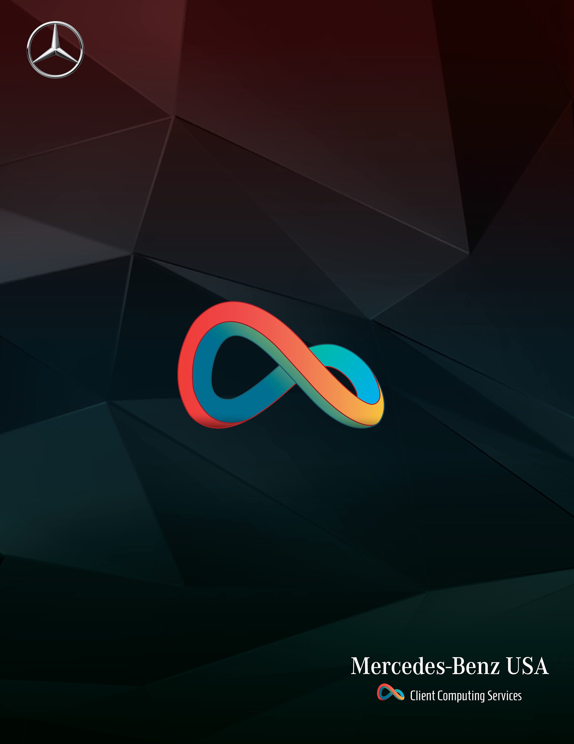
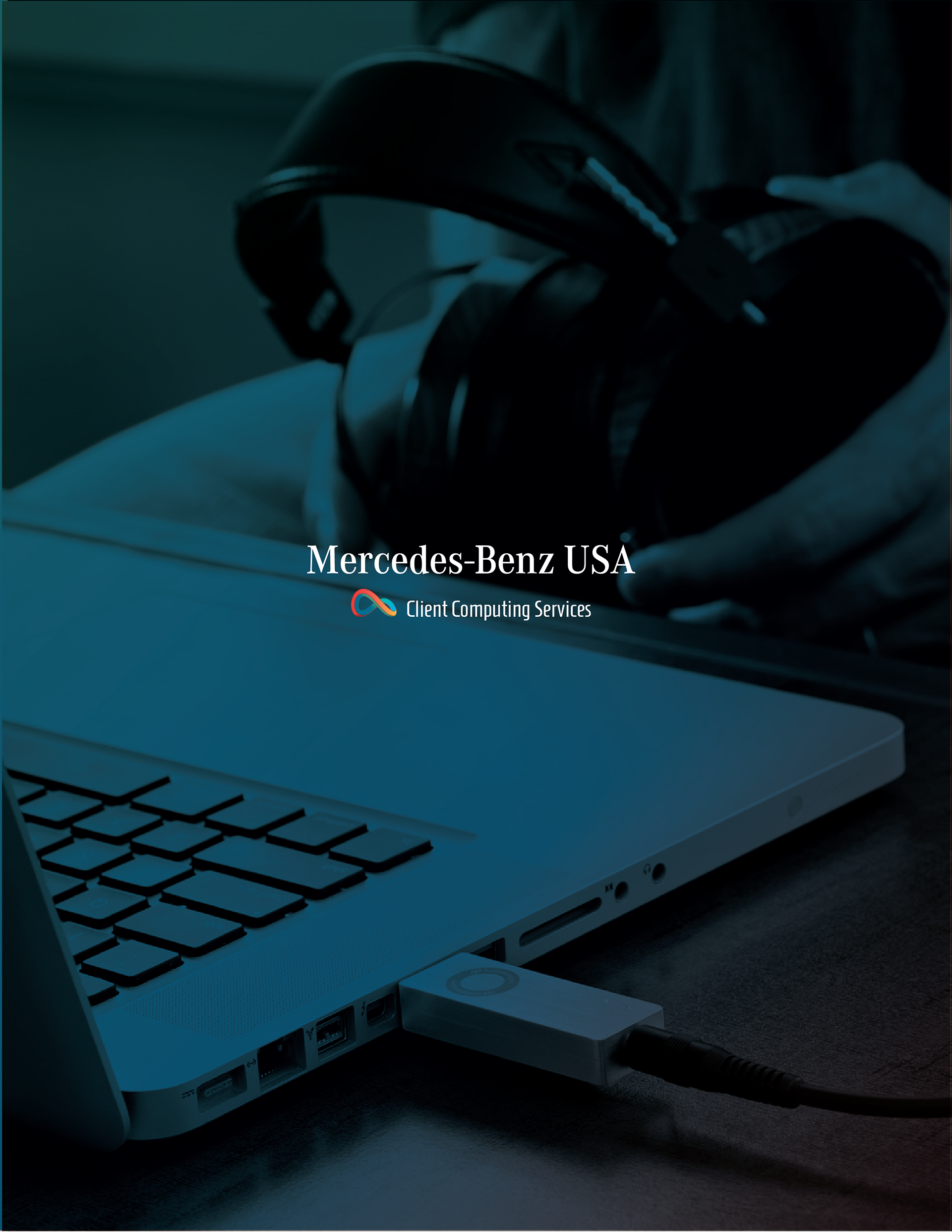
CLIENT: Mercedes-Benz USA
PROJECT: Build and customize a unique logo for the entire Mercedes-Benz USA "IT" department.
DETAILS: The Creative Marketing Specialist with MB USA contacted me last year to inquire about some logo work for the "IT" department. He said they were looking for something highly unique, yet resonating to anyone who views it. The "IT" director did not want to use the typical "IT" terminology, which led us to create and use "Client Computing Services" instead. This does sound a bit more professional, yet still stands alone with its own meaning and purpose.
The MB USA headquarters is based here in Atlanta, so I was able to go on-site to meet the "Client Computing Services" director and the Creative Marketing Specialist to talk more about what they were looking to represent the team. Having the opportunity to meet with these guys was an experience within itself. I made two trips – one for the introduction and project details, and the last meeting was to present the final set of logo ideas to the "Client Computing Services" director and his management team. The variety of logo ideas received an outstanding response, which made it challenging for them to decide on a single direction.
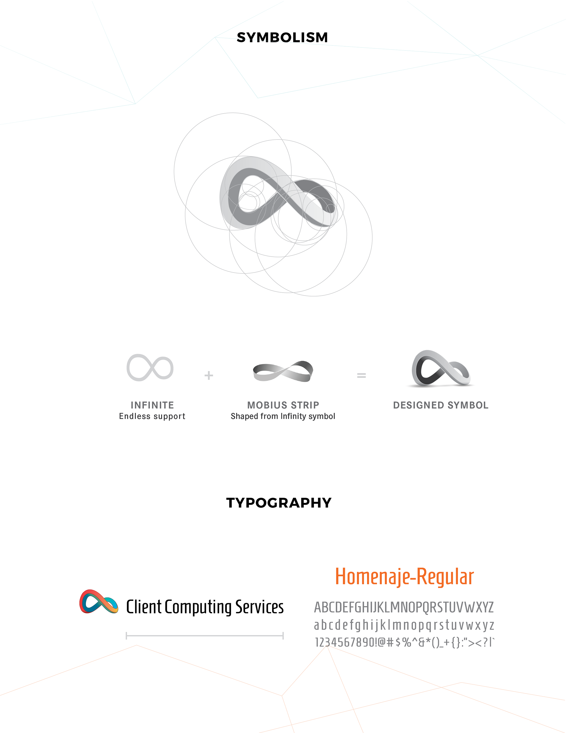
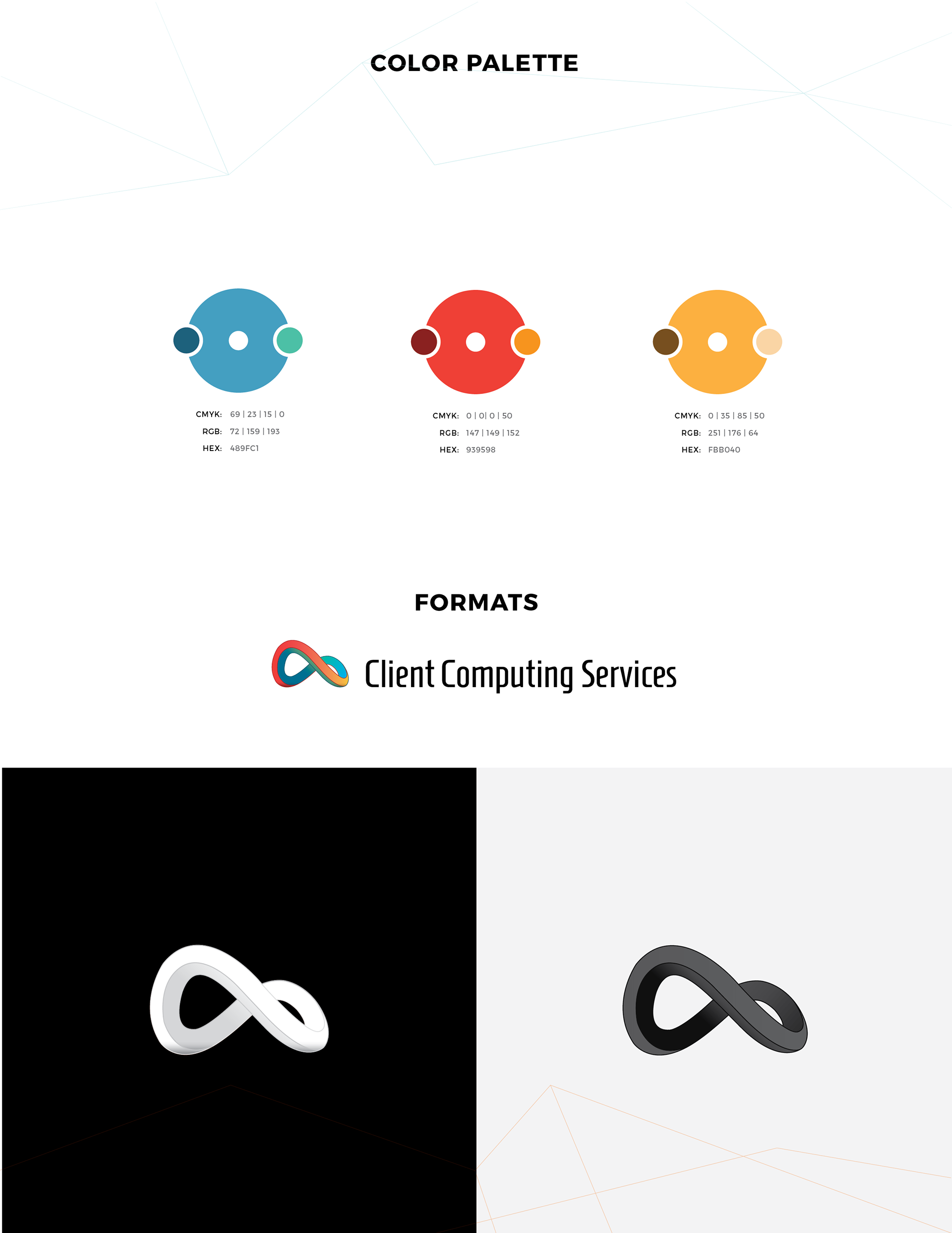
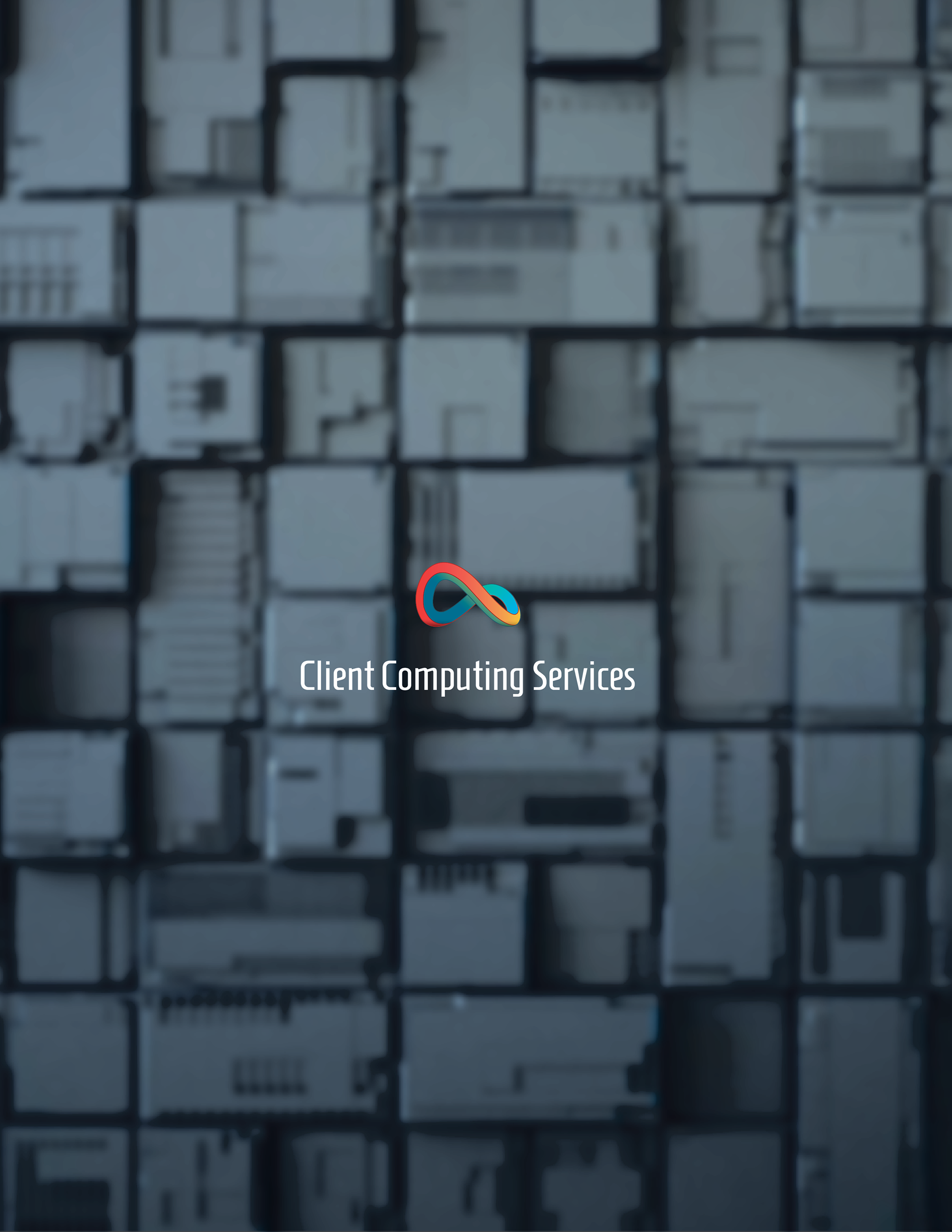
Over a three month period, multiple designs, sketches and ideas were built allowing us to eventually finalize on the 'mobius strip-like' colorful symbol design. The variety of colors and endless, one-sided 3D shape represents the constant, ornate and professional support the "IT" team provides day in and day out to the Mercedes-Benz company.
This project was a huge success!